Europa & Peter Nencini
'ough'ough
Read more
(Photo credit: Phil Wilson)
To accompany 'ough'ough, Europa and Peter Nencini's commission as part of Market Town, the artists wrote the following essay. A graphic version can be found here.
’ough’ough
Loughborough is a mid-size market town located in the very centre of England. You don’t need to look past the name before getting an indication of a more distinct character of place. ‘ough’ is one of the strangest letter sequences in the English language. It is pronounceable in no less than ten phonetic variations and Loughborough is the only word or name in English where it occurs twice. Our work in Loughborough has engaged us with thinking about identity and place and the graphic designer’s role in relation to this. Much of our time visiting Loughborough has been seeking out the unusual bits that contribute to the character of the town – the ‘ough’ and the ‘ough’ rather than the ‘L’ and the ‘bor’.
Identity Fascism
The phrase ‘corporate identity’ was ‘coined in the 1950s to describe how all of an organisation’s visible manifestations are designed to create a coherent whole associated with a specific theme, attitude, or personality’.1 ‘Identity’ in this context is metaphor that allows us to deal with companies as if they were people with individual characteristics, memory and a soul. When the language of these corporations is applied to a place an uneasy clash happens. The language of the world of profit and sales starts to define a place and a group of people. This raises questions of why a place needs to be sold – who is selling it, and who is it being sold to? A brand defines what something is – selecting and distilling chosen characteristics into graphic form. As a result of this, a brand also defines what the same thing is not. So if a brand is colourful – then it excludes a preference for monochrome, if it is playful – then it excludes the serious, and so on. ‘…simplification denies the complexity of life’s experience, for while simple statements, familiar and repeated imagery sell the product and the idea most efficiently, they also reinforce restricting separations.’2Contradictions are characteristics of a mixed society. Could a graphic identity be designed which is suitably diverse, and could it still be ‘coherent’ or is incoherence precisely the point?
A brand has been created for Loughborough by the business improvement district. ‘Love Loughborough’ is accompanied by a heart made up of smaller pictograms. The majority of these are applicable to most English towns and cities. However pictograms of the Carillon and the Sock Statue locate the brand in Loughborough. The brand echoes perhaps the most famous piece of place-based marketing – the ‘I heart NY’ design by Milton Glaser in 1977. What Glaser’s identity does so successfully is to allow the individual space for participation. If you choose to wear a bag that says ‘I heart NY’, then you choose to take part in the brand. You become the ‘I’ and enter into a dialogue with the city. The unsolicited remixes of ‘I heart NY’ further cement the participatory nature of the brand – I ‘pizza’ this, I ‘orange’ that – the brand is easily manipulated to give alternative messages, yet each of these messages reinforce a celebration of the city. ‘Love Loughborough’ doesn’t have this capacity for consumer participation. Instead, it acts as a command where you are ordered to ‘love’ the town. It is an attempt to dictate an opinion which is a problem because it’s something you need to sign up to or be left out of. This is symptomatic of the culture of ready-made, one size fits all place branding – where any notion of self-identity is subsumed by the eagerness to match ‘competing’ places. As a result these homogenous identities degrade the very qualities of the place they claim to embody.
New York is perceived as a cultural capital of the world, so the idea that everyone goes to New York and feels compelled to declare their love for it holds a certain amount of plausibility. We feel that the same is not true for everywhere which reminds us of this bagdesigned by Martin Frostner and Jake Ford which declared ‘I Like My Town’. There is a humble beauty about this message which seems fitting. The words were inspired by this quote by Georges Perec from the Species of Spaces:
‘I like my town, but I can’t say exactly what I like about it. I don’t think it’s the smell. I’m too accustomed to the monuments to want to look at them. I like certain lights, a few bridges, café terraces. I love passing through a place I haven’t seen for a long time.’3
Graphic Archaeology
For the past five years we have been working with local councils and community groups on a variety of public realm projects. There is a general sense in the briefing of such projects that there is a lack of identity in these places. What is this place? What was this place? What could this place become? For us a key requirement of responding to this task is drawing out and enriching a place’s cultural identity, to ‘add coherence to an existing neighbourhood through new interventions’4.
If an identity presents itself as the definition of a place, then it is immediately oppressive, but how can you graphically respond to a place without ending up with a single definitive brand? In these projects we often find ourselves looking for opportunities where graphic design can have a specific application: a wayfinding system for truck drivers, an identity for a community workshop, an alternative walking guide to an area. After gaining an understanding of the dynamics of a place we often find ourselves rewriting the brief in order to open up opportunities for our work to gain usefulness. We look to create situations where groups can form and have a graphic means of communicating, without a dogmatic stylistic direction claiming to represent everyone in the area. This approach allows for the multiplicity which is usually lost when characteristics of place are watered down into a graphic mark.
Stories help us understand a place. Our understanding of these stories defines how we think about a place, what we expect from it and what we give back to it. How the stories are remembered and told is a political issue that defines a place – what stories we retell and encourage, and what stories we allow ourselves to forget. Traditionally myth and folklore were created and passed down through tales and songs. These tales have provided a basis upon which the cultural identity of places are built. Stories are later embedded naturally into the artefacts, architecture and landscapes which survive beyond their time, these are physical signs which hold on to narratives. Stories are also actively recorded in the urban fabric in the form of monuments – follies whose primary purpose is the act of remembering. History is written by those with the money and influence to make such recordings.
Most places have established stories that are told about them. In the case of Loughborough, the presence of a company like Brush who build and export turbines globally becomes a characteristic of the town. The monumental Falcon Works overlooks the train station and the Brush social club extends the influence of the company further into the social fabric of the town. But there are pricklier stories too. Loughborough’s Immigration Enforcement Reporting Centre registers immigrants based in the three surrounding cities of Nottingham, Derby and Leicester. What place is there which could be more relevant to a discussion on identity than the centre which grants a British identity to a lucky few of those who visit it. Two very different organisations both playing hugely significant roles in the town, but it’s the Falcon works which provides the material suitable for the Loughborough’s postcard – a typical method by which an image of a place gets projected to the outside world. But internally stories are more readily told through informal methods such as chat, gossip, argument or joke. These have an immediacy which is powerful to the few who hear them. You can bet the conversations in the local pub are more often about the Immigration Enforcement Reporting Centre than they are about the Falcon Works. These everyday conversations might create a more powerful impression then what is on the postcard, but how quickly does that impression fade with time.
Not every story can be told and many won’t feel relevant to a given project. But as a working methodology we are interested in excavating these artefacts and exploring some new mythologies out of fragments of the past and present. Objects are often able to articulate things that humans cannot. In the words of the designer Norman Potter ‘…every human artefact – whether painting, poem, chair, or rubbish bin – evokes and invokes the inescapable totality of a culture, and the hidden assumptions which condition cultural priorities’5. A philosophy of design and production, of place and time, is embodied in each and every object. By looking at the materials and forms at hand in a place, the byproducts of human endeavours, we get a sense of the layers of history that have laid the foundations of a place. These materials, and the stories that come with them, can then form the basis of a graphic response to a place.
Ad-Bricolage-Hocism
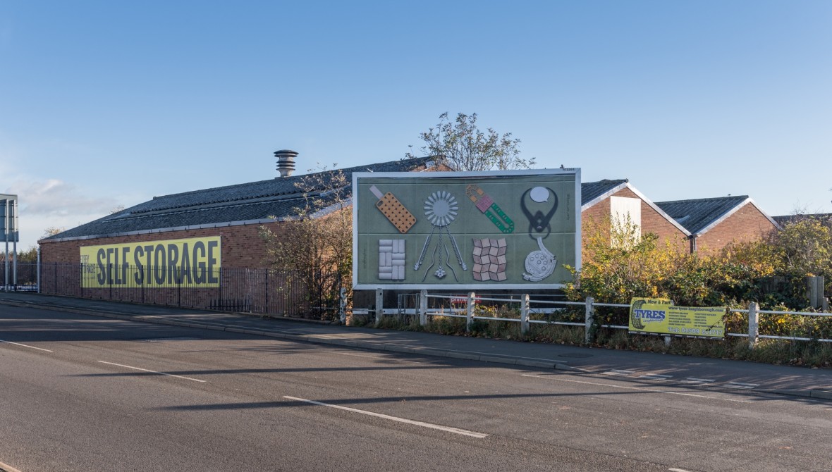
In the book Adhocism Charles Jencks and Nathan Silver describe ways of working which reuse existing materials in order to solve new problems. Adhocism is the reconfiguring of existing elements in order to achieve a specific purpose. ‘Designers are often taught to reduce things to their essence, but in fact that process too often results in the reduction of the ideas to only one of their parts.’6 An adhoc approach favours nuance and pluralism over reduction and standardisation.7 The Loughborough coat of arms was created in this spirit. A bricolage of existing forms taken from three families who had once owned the town. The bull’s head and the maunch (lady’s sleeve) are symbolic of the Hastings family. The lion is taken from the Beaumont Family. The cockleshells and lace pattern come from the Arms of the Despencer Family. Whilst these individual forms are already reduced they carry with them a broader historical narrative and a more open ended set of references and embrace pluralism.
As well as associative value, objects carry traces and histories all of their own in a way that reduced graphic forms struggle to retain. A logo, for example, craves reduction for ease of reproduction and immediacy of communication. This reduction of messages is what we see in many place-based branding projects and is something we see happening in architectural spaces too.
In Belco, Northern Ireland, the local authorities felt that it was necessary to bring new life to the high street ahead of the 39th G8 summit where it would be on show to world leaders and press. In a number of shops the authorities installed printed vinyl in the windows which showed busy vibrant shops. The shop shown herewas once a butcher’s shop but had gone out of business. In this moment two versions of Belco exist at the same time – the image of the place and the real place. Ironically the official theme of the 2013 summit was transparency.
Whilst we really enjoy this brilliantly executed illustration of how all places are a combination of a physical place alongside a projected image of a place, we suspect it wasn’t intended in this spirit. Instead it shows a more sombre longing for another time, an idealised image of a time when the high streets role within society served a different level of importance. By pretending that time and change hasn’t happened it feels like history is being denied. Pretending that nothing has changed since the 50s is not celebrating history, instead it denies the layers of change and complexity that make something old.
‘Attempts at returning buildings to their original condition … robs them of the very quality for which they are prized; oldness, leaving behind shells that show no sign or wear and tear and are innocent of history.’8
But then again perhaps this ‘original condition’ never existed in the first place, and the longing that is felt, particularly in the Belco case, is simply concealing this truth. ‘Nostalgia like any form of narrative, is always ideological: the past it seeks has never existed except as narrative, and hence, always absent.’9 By looking for and highlighting unique layers of local history, one could be hiding the fact that under corporate capitalism every place is in fact the same. There is nothing unique, just Costa Coffee. Uniqueness is exactly what the mercantile competition craves, nothing more.
Visual Accent
Where there is a need for visual communication there is a need for a graphic language. We are much more comfortable with the term ‘language’ than we are with ‘identity’. A language implies something which is pliable and can be shaped by its users. Identity implies something more rigid, a finished item to be respected and adhered to.
We are specifically interested in the difference between our common language and the discrete variations of articulation within in a specific place. A familiar example of this is the accent with which we speak. This is also true of how we communicate visually. The visual accent of a place is what we are often looking to unearth in projects which deal with place.
With this commission we have been looking to distinguish between what we feel is an English characteristic, what is a Loughborian characteristic and what is an individual characteristic. At this point can we start to identify what the accent of the place is? And can we learn to speak in this voice, or will we always be ‘putting on’ this accent?
Foreign Eyes
Loughborough is located at the centre of a triangle of cities, and the main roads out of town Leicester Road, Nottingham Road and Derby Road attest to this. As a market town Loughborough has served as a common meeting point between the cities’ traders.
Our approach to working in Loughborough has been through a method of triangulation – gaining a variety of viewpoints which allow us to gain a sense of the place – and doing this through a series of organised and also random encounters with local people, for example, meeting two Loughborough Town of Sanctuary volunteers outside the East Midlands Immigration Enforcement Centre. They provide a welcome, some practical information and the offer of a free hot drink to asylum seekers tasked with travelling weekly to sign in. This led us to John Storer House who provide those free hot drinks and further conversation in a vibrant community space. There a one-day-a-week volunteer spoke with relish of the varied requests that come her way. The port-of-call reception desk, offering cheap locally grown courgettes, epitomised this span of exchange, a narrative of civic actions and activism in a climate of cuts.
A tatting-shuttle in the Charnwood Museum told of nineteenth century lacemakers supplementing their factory work with this complex hand technique. This interaction of hand and tool brings us to the Sports Technology Institute’s Steve Carr and his test run of a bonelike, low-melting-point, plastic tennis racket grip, designed for a para-athlete who had lost their ability to grip the racket. Steve is head of technical services and runs the test lab which holds a cross-section of kit from ball kicking robots and motion capture rigs to lathes, drills and welders. This oscillation from hardware-to-software-to-hardware mirrors Steve’s agility in tackling each research project whether it be the aerodynamic testing of Adidas’ next World Cup football, or the design and fabrication of a bespoke archery frame for Paralympian Danielle Brown. Whilst explaining the structural composition of dismembered match balls, Steve referred to the two interlocking panel types as ‘turbines and rotors’ recalling our visit to Brush and their turbogenerator manufacturing.
Through a day of what we could call ‘identity consulting’ we asked passers by to share their stories of Loughborough with us. We set up in a vacant shop in the Carillon shopping centre. Visitors were asked to create object compositions with produce from the market and other pre-prepared objects.
What can we bring to the place through working here? We began as outsiders, looking at the town with the fresh eyes of a tourist. This provides us with both advantages and weaknesses over those who are familiar with the place. Foreign eyes notice things that familiar ones overlook, but at the same time they lack knowledge. Through a process of discovery, time spent in the place and encounters with locals we begin an act of learning and processing before being able to convey something back visually.
A place can never be viewed as a whole. Taking a reading of a place is a useful way by which we can provoke a conversation about a place. We have worked with a range of objects that reference stories that we have encountered in the city. The work we have created is not presented as the new identity for Loughborough, it does not claim to define the place, but it is a response to Loughborough that explores its identity in an open ended way. Through a juxtaposition of objects we encourage viewers to reflect on Loughborough and provoke further thought about the place. We explore no more than a few of the infinite number of stories that make up the town. Our selection of objects and our stylistic preferences are deliberate and subjective, but this shows the very essence of personal involvement that is lacking in the bland, un-nuanced branding that has come to define many towns and cities.
1 Wally Olins, On Brand, Thames and Hudson, p204
2 Sheila Levrant de Bretteville, A Reexamination of Some Aspects of the Design Arts from the Perspective of a Woman Designer, Arts in Society: Women and the Arts, Spring–Summer 1974, p116
3 Georges Perec, Species of Spaces and Other Pieces, Penguin, p63
4 Mae, Places for Strangers, Park Books, p28
5 Norman Potter, What is a Designer, Hyphen Press, p15
6 Sheila Levrant de Bretteville, A Reexamination of Some Aspects of the Design Arts from the Perspective of a Woman Designer, Arts in Society: Women and the Arts, Spring–Summer 1974, p115
7 Charles Jencks and Nathan Silver, Adhocism, MIT Press, pviii
8 Irénée Scalbert on Raphael Samuel, Never Modern, Park Books, p34
9 Susan Stewart, On Longing, Duke University Press, p23
'ough'ough
Read more
Loughborough University Arts
Martin Hall Building
Loughborough University
Loughborough LE11 3TU